White Rhino Coffee
Web Design
To reshape a brand's webpage.
- Project Objective
- The objective of this project was to create a complete website redesign consisting of a set of three redesigned websites surrounding a business of our choice. The set must include a home page with two separate content pages.
- Project Role
-
Designer
Reseacher
Project Team Members:
Oliver Harris — Designer & Researcher - Project Timeline
- This project spanned over 2 months starting Oct 2021 to Early December 2021.
The Process
The Research
Introduction
Our Initial Assignment
The objective of this project was to create a complete website redesign consisting of a set of three redesigned websites surrounding a business of our choice. The set must include a home page with two separate content pages. The design had to match the businesses’ brand colors and design. This project was a collaborative effort with me and another designer, Oliver Harris. We would each share an research role as well as contribute to the final website design.
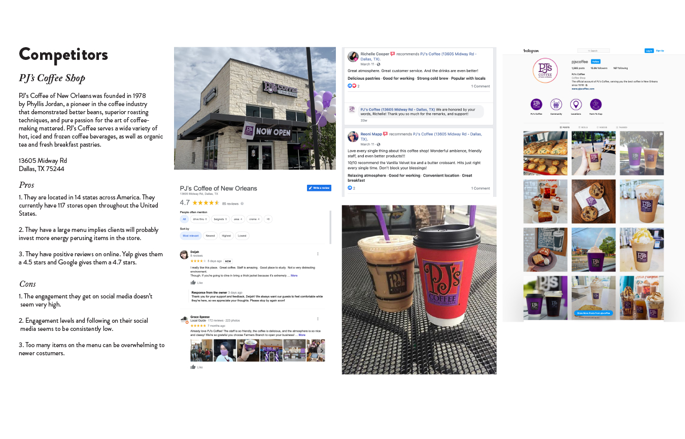
There were various research methods involved in this project. Research included a client questionnaire, an analysis of the clients’ direct competitors, the SWOT (Strengths, Weaknesses, Opportunities, and Threats) analysis as well as creation of a person to thoroughly address our clients needs.
Who is Our Brand?
Our Initial Questions
To create a true website redesign, it is imperative that you learn as much as you can about the company before starting. That what my group hoped to accomplish with the first part our research process, the client questionnaire. We reached out to company for assistance, and they gave us some information to base our website on. We focused on these three main categories to really dive in company and what is stands for.
- The Message
- Background
- Company Objectives
- The Message
- First and foremost Whine Rhino wanted to establish themselves as a brand that really is passionate about coffee and community. They wanted to differentiate themselves between other big brand restaurants that have lost their meaning and instead dropped the quality of their coffee in favor of profits.
- Background
-
White Rhino Coffee is an independent coffee shop serving the DFW area with 7 unique locations specializing in hand crafted coffee. The founder Chris Parvin hoped to create a coffee shop centered around community and fun.
"We use coffee to connect with people. We aren’t in the coffee business; we’re in the people business."— Chris Parvin, Company Founder - Company Objectives
- Through our questionnaire we found that White Rhino’s top three objectives were to expand the brand, stay connected with their consumers, and to deliver exceptional craft coffee and culinary experience while creating a community around coffee.
Competitor Analysis
The SWOT Method
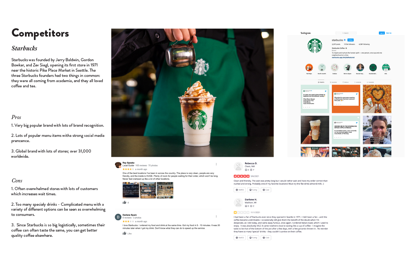
Our second method of research was to complete a SWOT analysis based on the brand and its various competitors. The SWOT method identifies a company’s Strengths, Weaknesses, Opportunities and Threats. This information was compiled from public company data and an overview analysis of its competitors. For this assignment we chose the top competitors Starbucks and PJ’s Coffee Shop. Starbucks was chosen because they are large in the coffee industry and PJ’s who is another independent chain who is a direct competitor of White Rhino.
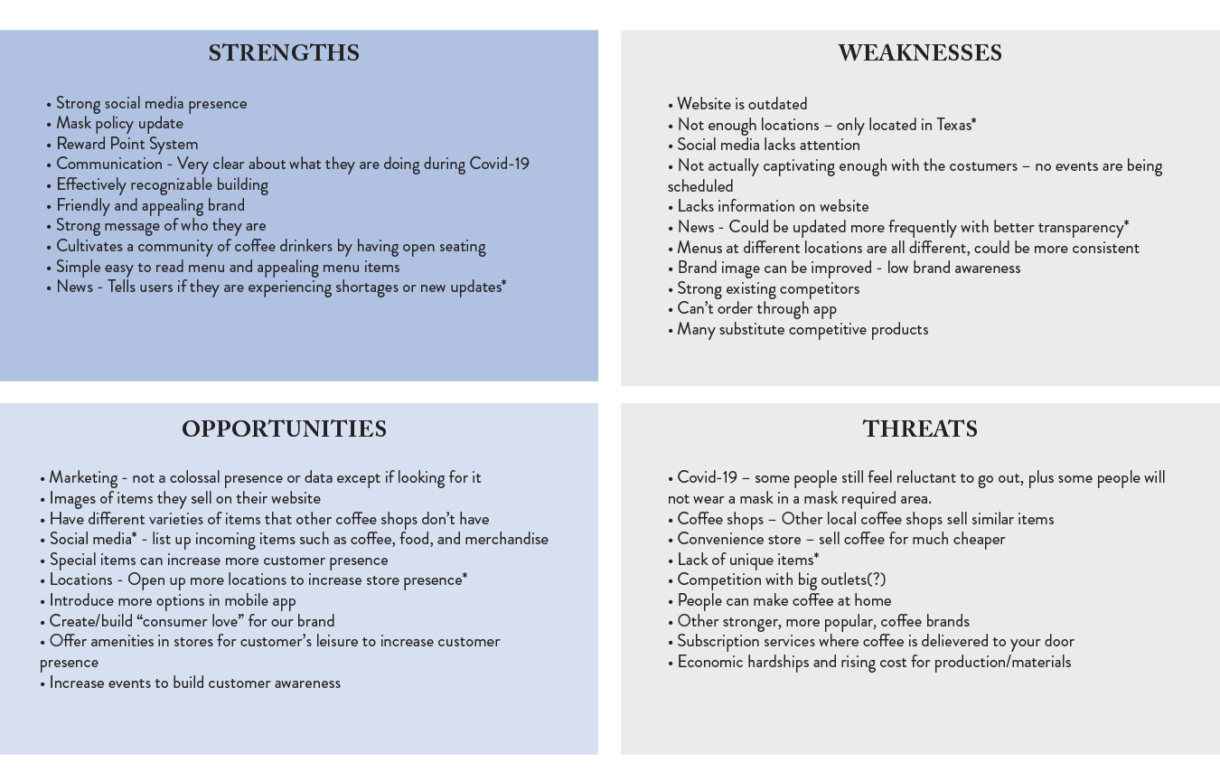 Our SWOT analysis
In this exercise we found that while there are many strengths in the brands current social media presence, it was however lacking strength in its webpage. For a company that had a strong social media presence the webpage was often found to be clunky and outdated. We broke down this data into key goals that we wanted to accomplish:
- Addition of an online ordering system from the webpage
- Organization of locations
- Build customer awareness of events to enhance the brands commitment to community
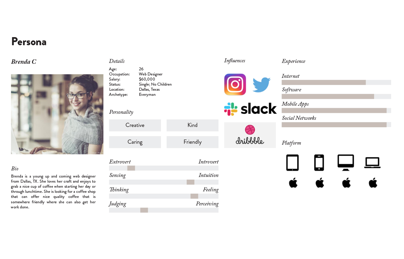
The User Persona
In addition to our competitor analysis, we created a persona for the brand named Brenda C. This persona would appeal to the ideal consumer for White Rhino who we believed had the following characteristics:
- Someone who believed in the quality of their coffee
- An extroverted person, one who would enjoy White Rhinos events and lounging areas in which people can relax and spend time together
- Someone who fit the age group, which we believe White Rhinos demographics appealed towards middle class people between the ages of 21-35
Key Goals
With the information gathered from multiple research sources, we could begin to set a certain set of goals that we wanted to present to our customers. We wanted to ensure a clean and simple presentation of brand information while giving customers easy access to online ordering, location information and more. We focused on what we believed the end user would prioritize when browsing our webpage.
Our Redesign Plan
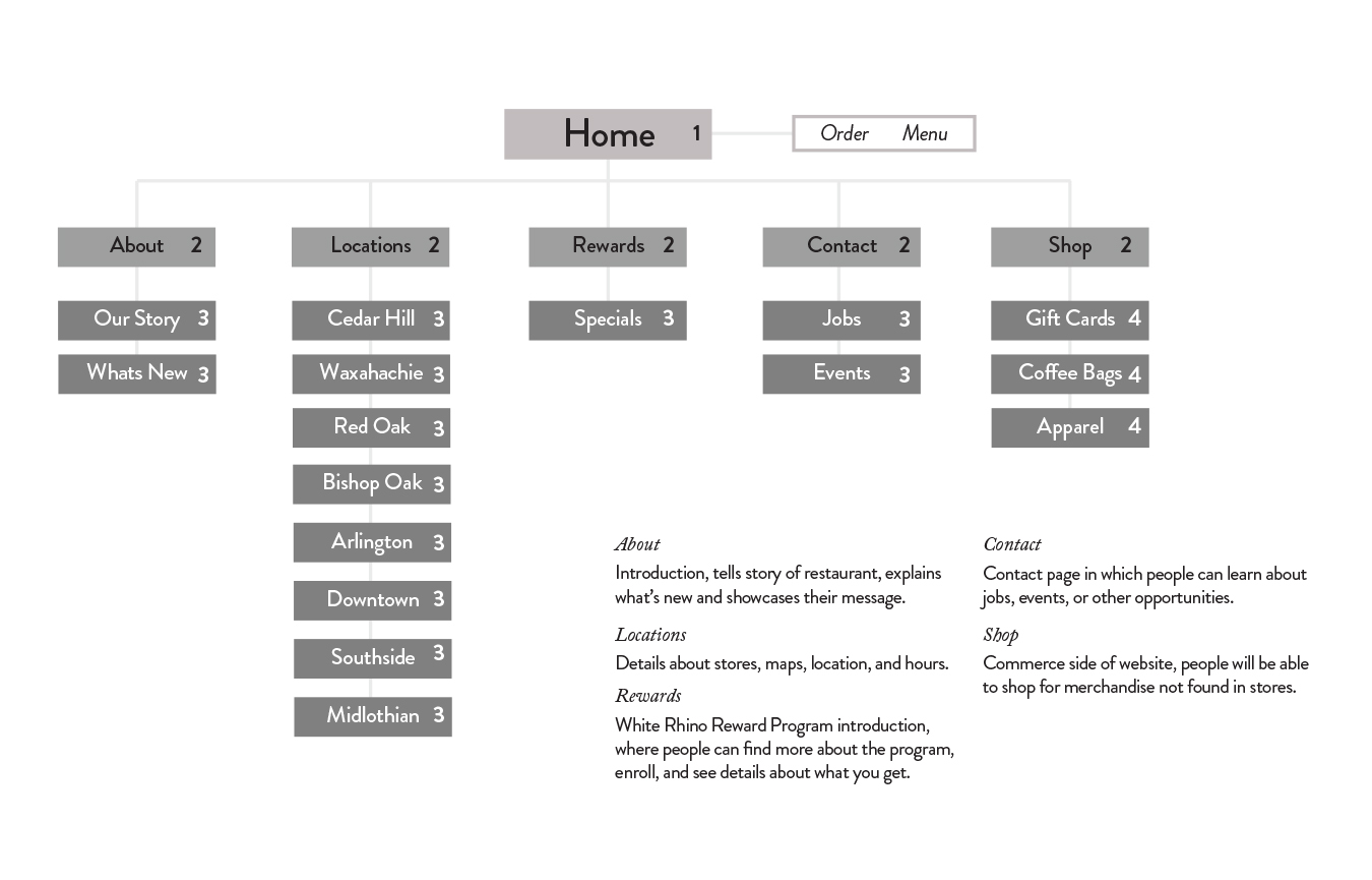 Our reworked sitemap
Constructing the New Website
The Site Map
With our users in mind, the first thing we wanted to organize was the navigation bar. We recreated the sitemap to best fit the design choices we wanted to establish. While the original sitemap was busy and included various unnecessary elements, we streamlined the number of items in the bar for a more concise look that was easier to read and more aesthetically pleasing for the end user.
Brainstorming
For our design we wanted to be distinctive to our brand while also looking fun and bringing a sense of community. We stuck with the brand’s striking choice of blue which we felt would bring a sense of calmness and good feeling. In our initial brainstorm we also wanted to show beautiful pictures of coffee and the people who make it.
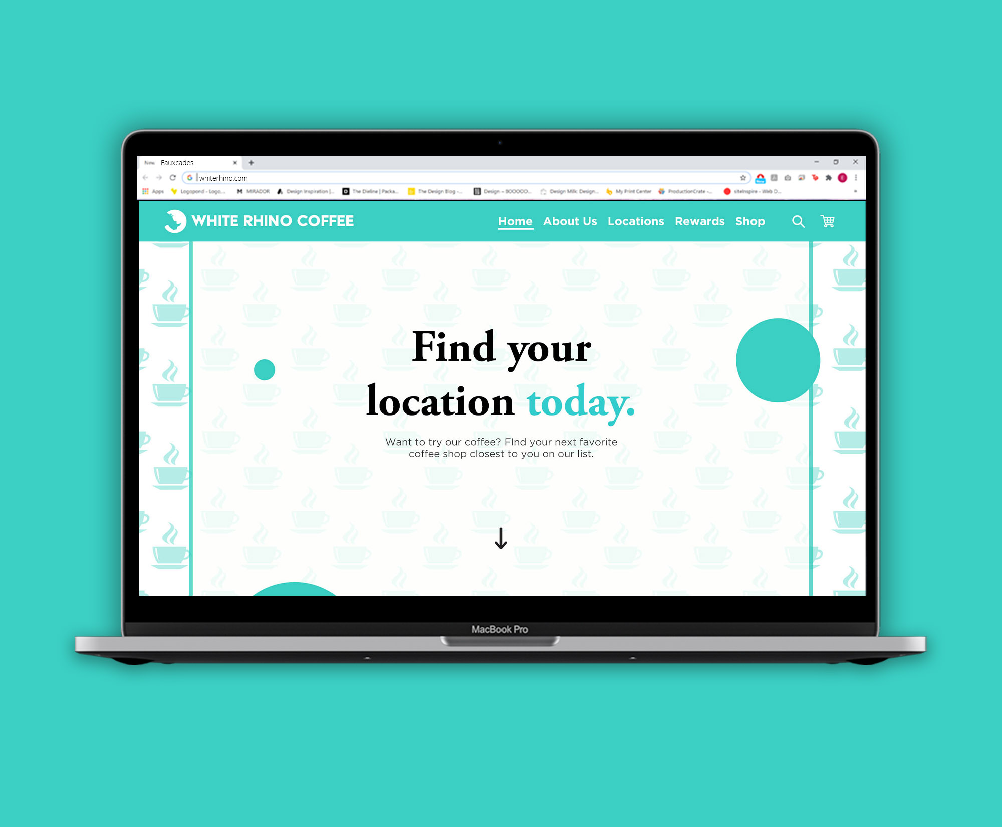
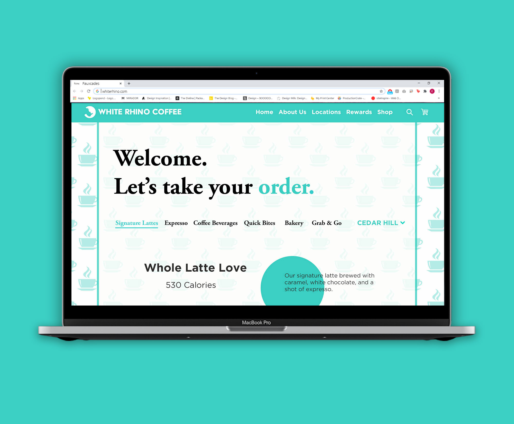
The three pages we settled on the creating were the home page, a locations page, and an ordering page. These three pages we felt would best represent in the goals that we wanted to accomplish for our users.
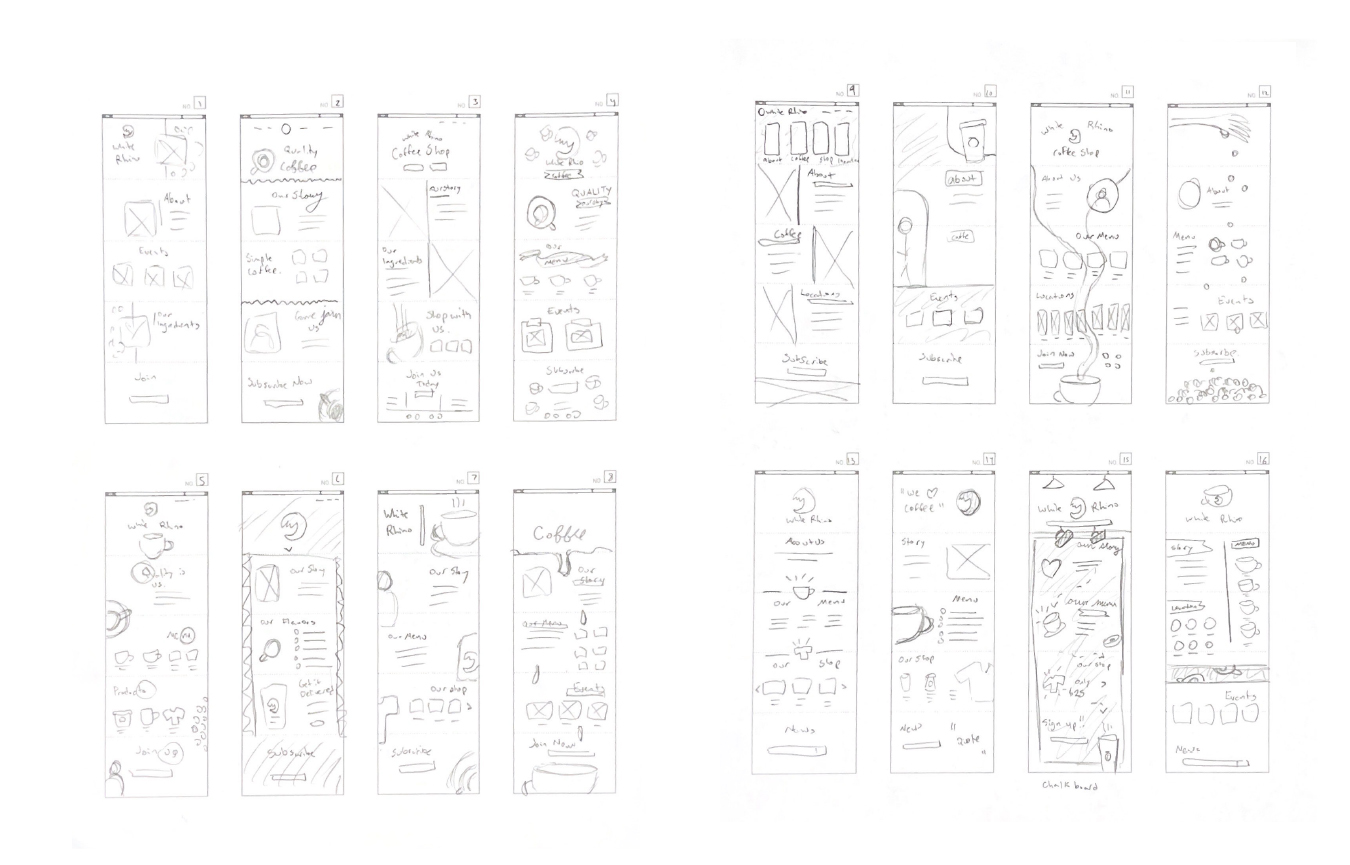 A collection of the various wireframes and layouts I brainstormed
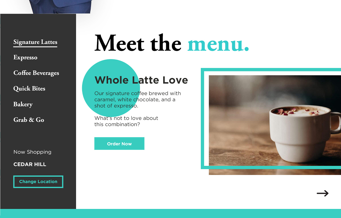
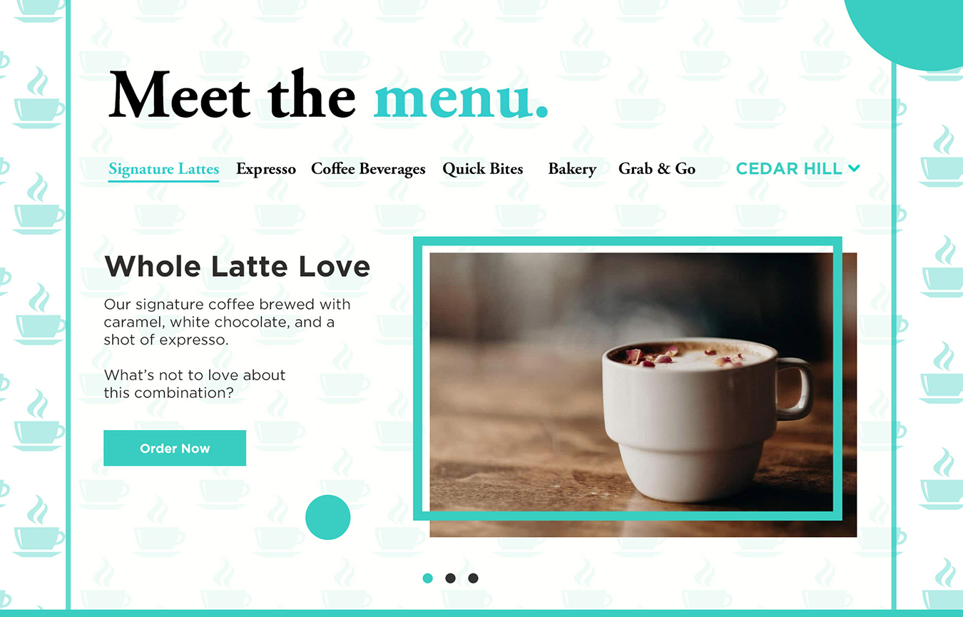
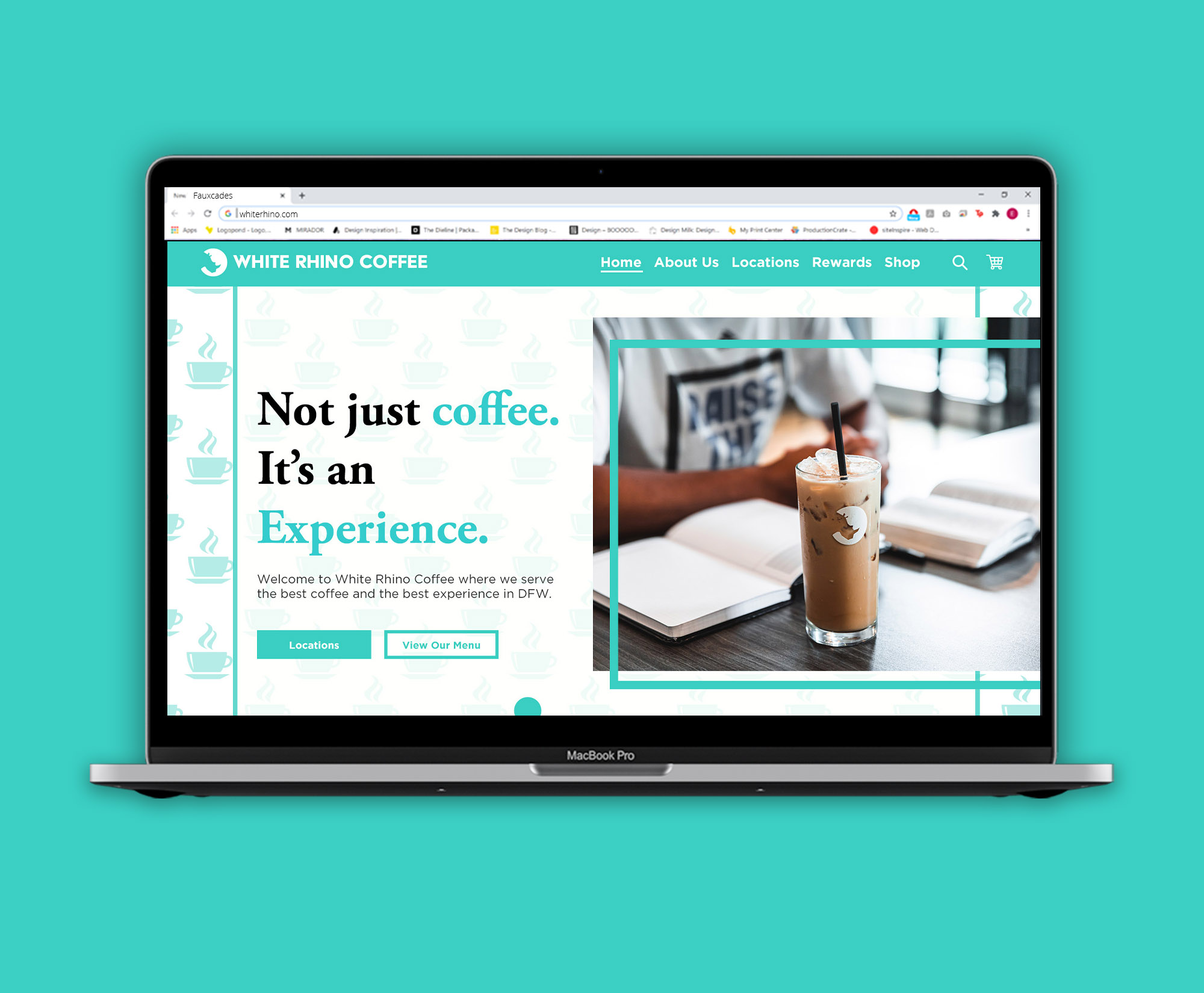
 The final redesign of the White Rhino home page
