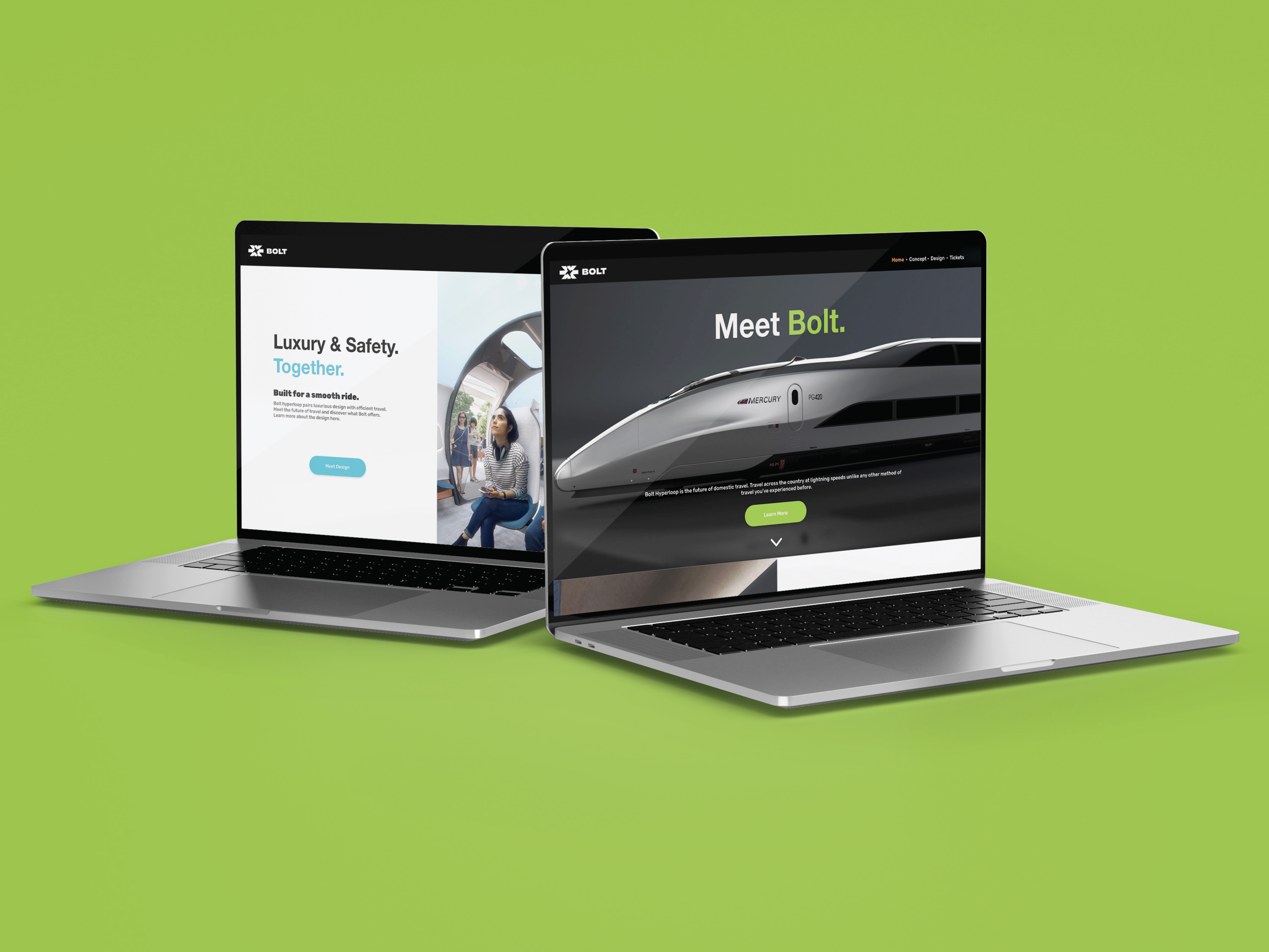
Bolt Hyperloop
Web Design/ UX Design
To create a world-class mobile experience.
- Project Objective
- The objective of this project was to create a website design as well as screen for a mobile application.
- Project Role
-
Designer
Reseacher
Project Team Members:
Neiman Ford — Advertising Design
Bailey Gallegos — Branding
Vince Escobedo III — Branding / Design - Project Timeline
- This project spanned 6 weeks starting Late August 2021 to Early October 2021.
The Process
The Research
Introduction
Our Initial Assignment
The initial assignment was to create a full brand experience for a fictional company of your choosing. Each group must have brand materials such as stationary sets, advertisements, and a website or mobile app. For our group we decided to create a futuristic hyperloop transport company named BOLT. This company would focus on fast hypersonic travel throughout the United States. My role in this group project was the primary UX Designer to create a website and mobile application for our company.
While the assignment only needed a website or an app, I took it upon myself to create both. There were various UX methods involved in this project. This included User Flows, Site mapping, Wireframing and other various methods to create our mobile app and website.
Who is Our Brand?
Our Initial Questions
When creating a fictional company, you must begin with addressing the business role of the company. Our group decided to focus on futuristic transportation. We believe that methods of travel would innovate exponentially in the coming future. Our company would lead this transportation trend by offering hypersonic travel throughout the nation with a focus on modern luxury train cars that could be used for business and consumer clientele. BOLT is an acronym for the words Business, Opportunity, Leisure, and Travel. We believed that these words represent the message that our company stands for. Our team felt that the BOLT acronym would connect with people and be seen as the next top choice for travel for consumers.
Our Research
Company Competitor Analysis
When researching the branding trends for our company, I decided to focus on a couple of other business that were trying to make the hyperloop a reality. In my research I found there were many companies that were focusing on the hyperloop transportation business, most notably Tesla and Virgin Hyperloop.
The User Flow
When creating my design for the mobile app, my first step was to figure out what the users need. To discover that, I must first determine how the user would interact with the app. In my initial brainstorm I created several user flows of the features that I felt were most important to the functionality of our concept app. These features would cover the main objectives of what we wanted, which included:
- Mobile Ticket: The ability to board our hyperloop with just a simple mobile ticket
- Travel Guide: A showcase of our favorite destinations and the speed it takes to get there with the hyperloop compared to other methods
- Bolt Plus: A premium ticket upgrade subscription to our most important users and to increase revenue
The Website
In addition to my initial research and preparation for my mobile app, I also created a sitemap for the website. This website would work in conjunction with the mobile app while also offering a broader explanation of what a hyperloop was. The main goal of the website was to draw people into the idea of the hyperloop and show people the benefits of choosing the hyperloop over the traditional methods like airplanes. From the website you can explore the hyperloops beginnings and, with the mobile app, send tickets from your computer to your phone.
Brainstorm
Constructing Our App
Wireframes
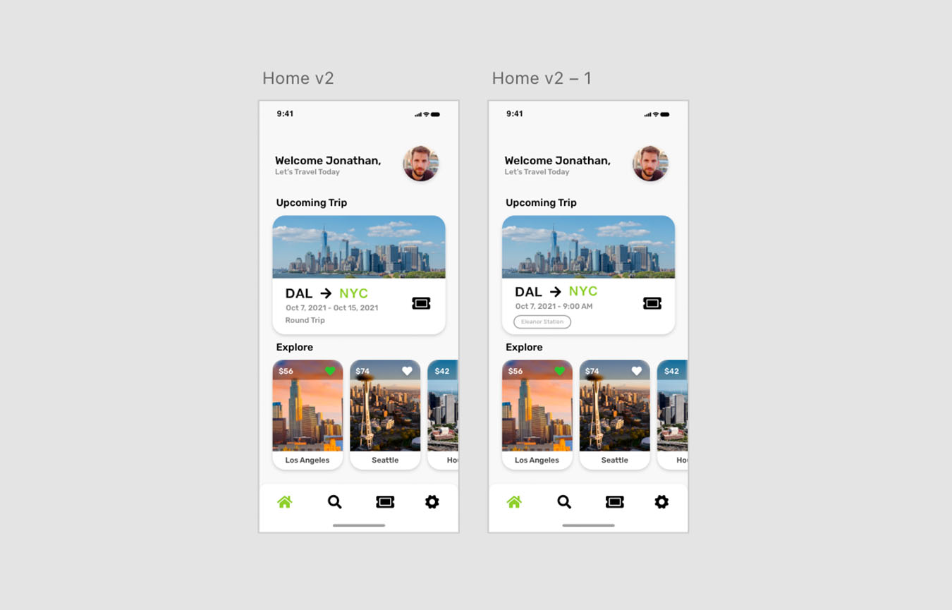
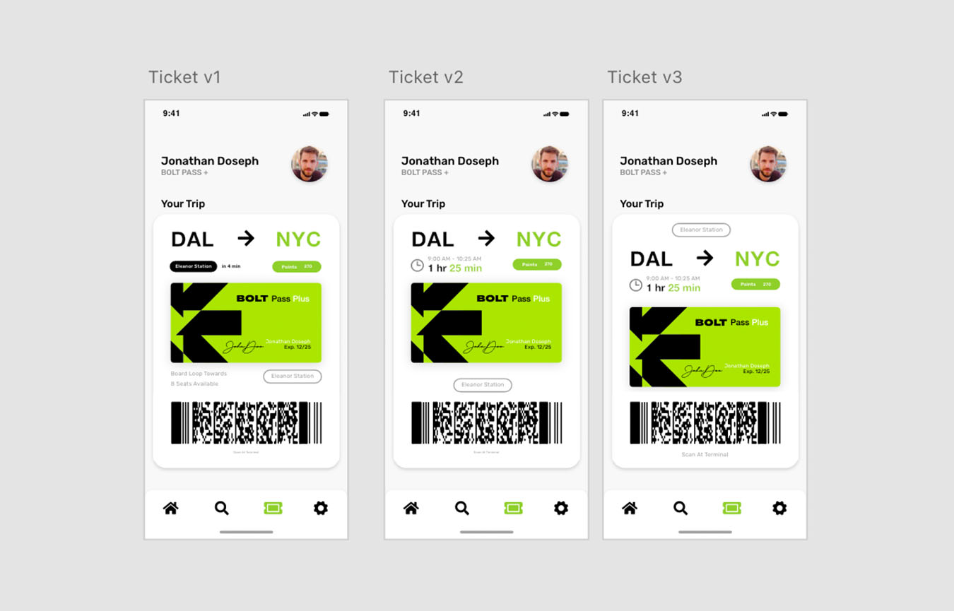
With our user flows in hand, the next step was to create rough wireframes of the layout that I wanted to create for our app. This spanned many iterations as the idea of the app was constantly evolving. This was the stage where we felt that we could make the most change through our app before moving on to the next design phase. In this process we identified some key priorities that we wanted to focus on:
- Tickets
- Destinations
- Travel Time
Our Key Goals
We wanted to make our app as simple to use as possible and these key points ensured that we would focus on our main goal: to get people to travel with us. First, we focused on presenting the user with popular destinations with travel times. Showing a comparison in travel times would convince users that BOLT was the way to go in terms of travel time. In a hyperloop system, travel times could be shortened but as much as half in comparison to traditional airplanes which we wanted to show the users. Second, we wanted to make the ticketing process as easy as possible to obtain and use in terms of boarding. Mobile ticketing is the new standard for travel, and we wanted to experience to be seamless whether you were using a computer or a mobile phone.
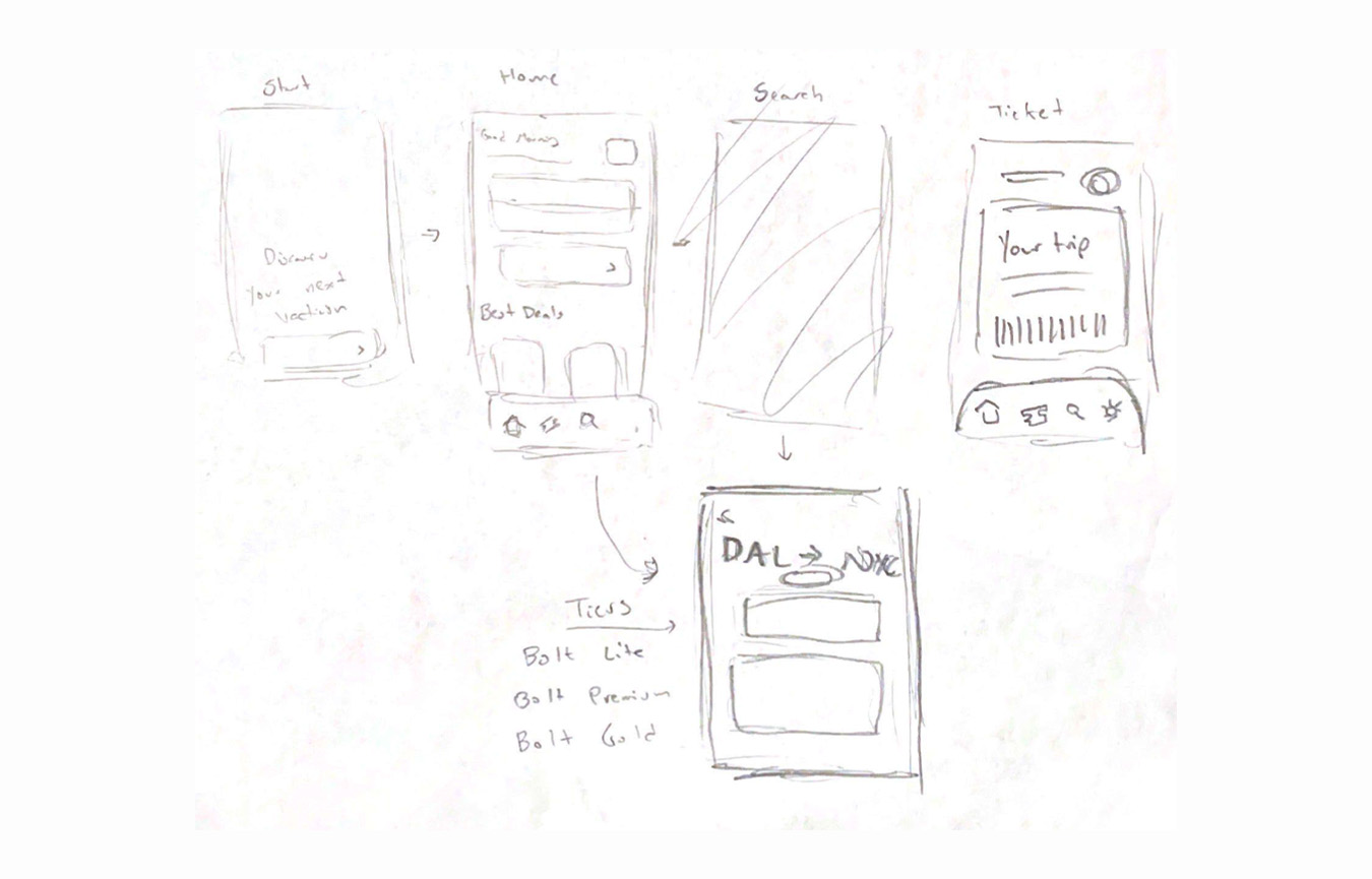 A rough inital wireframe of the mobile app
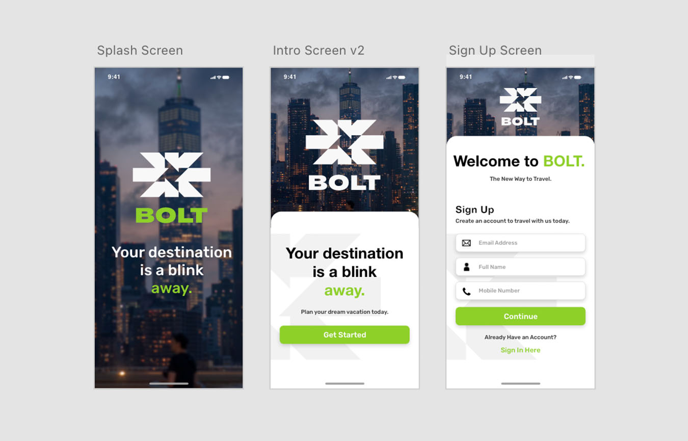

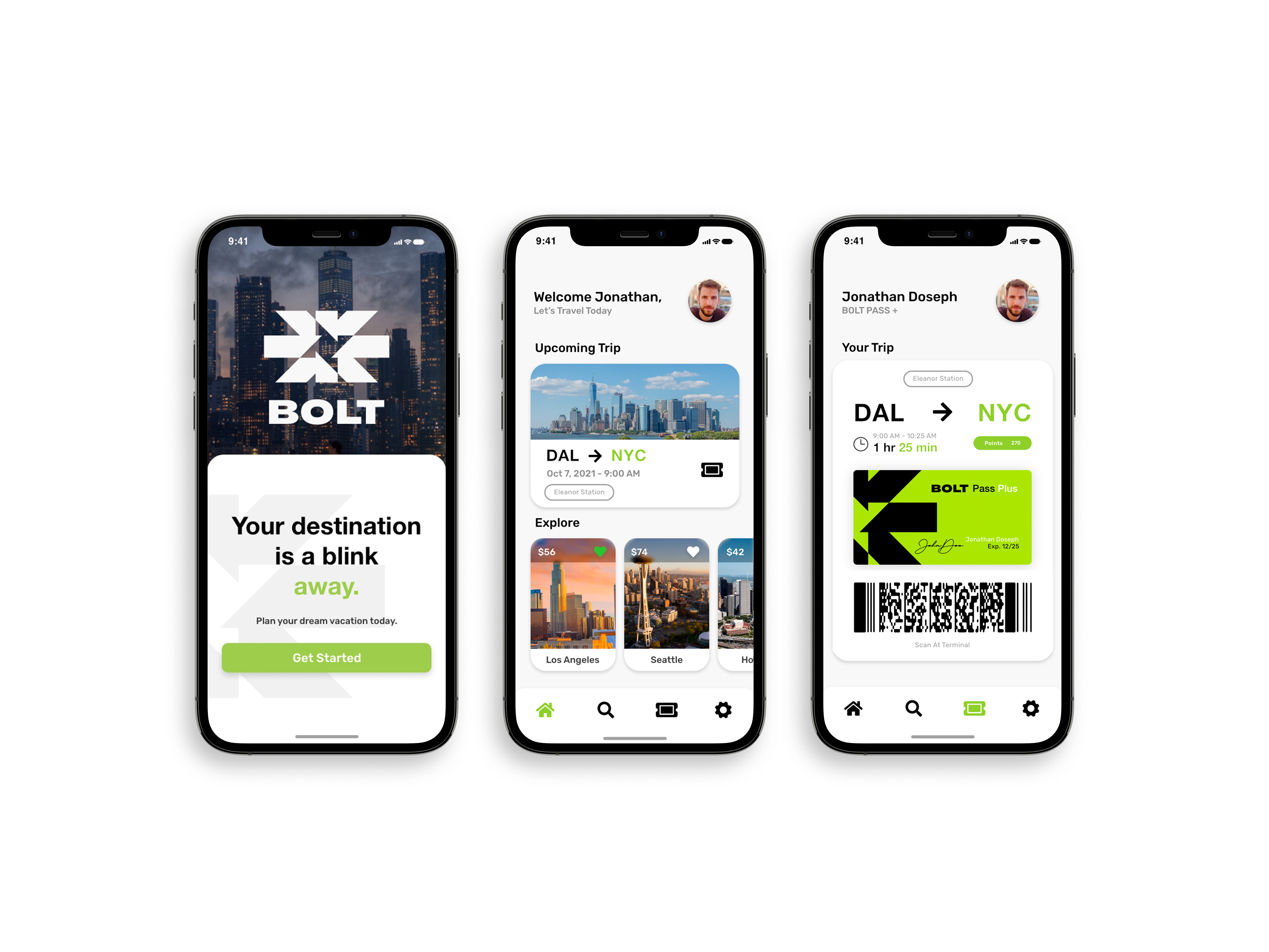 The final design of the BOLT mobile app
