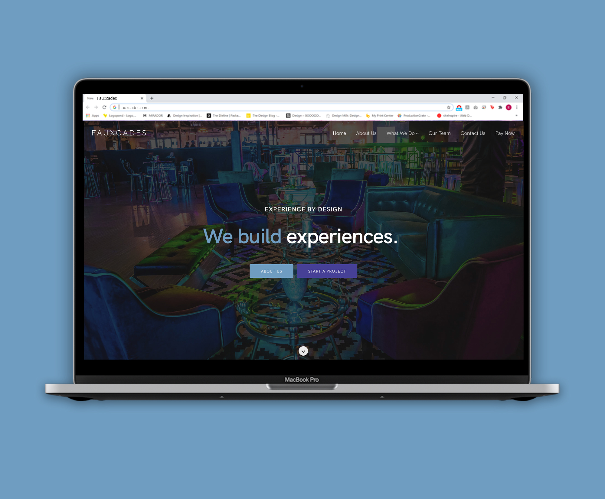
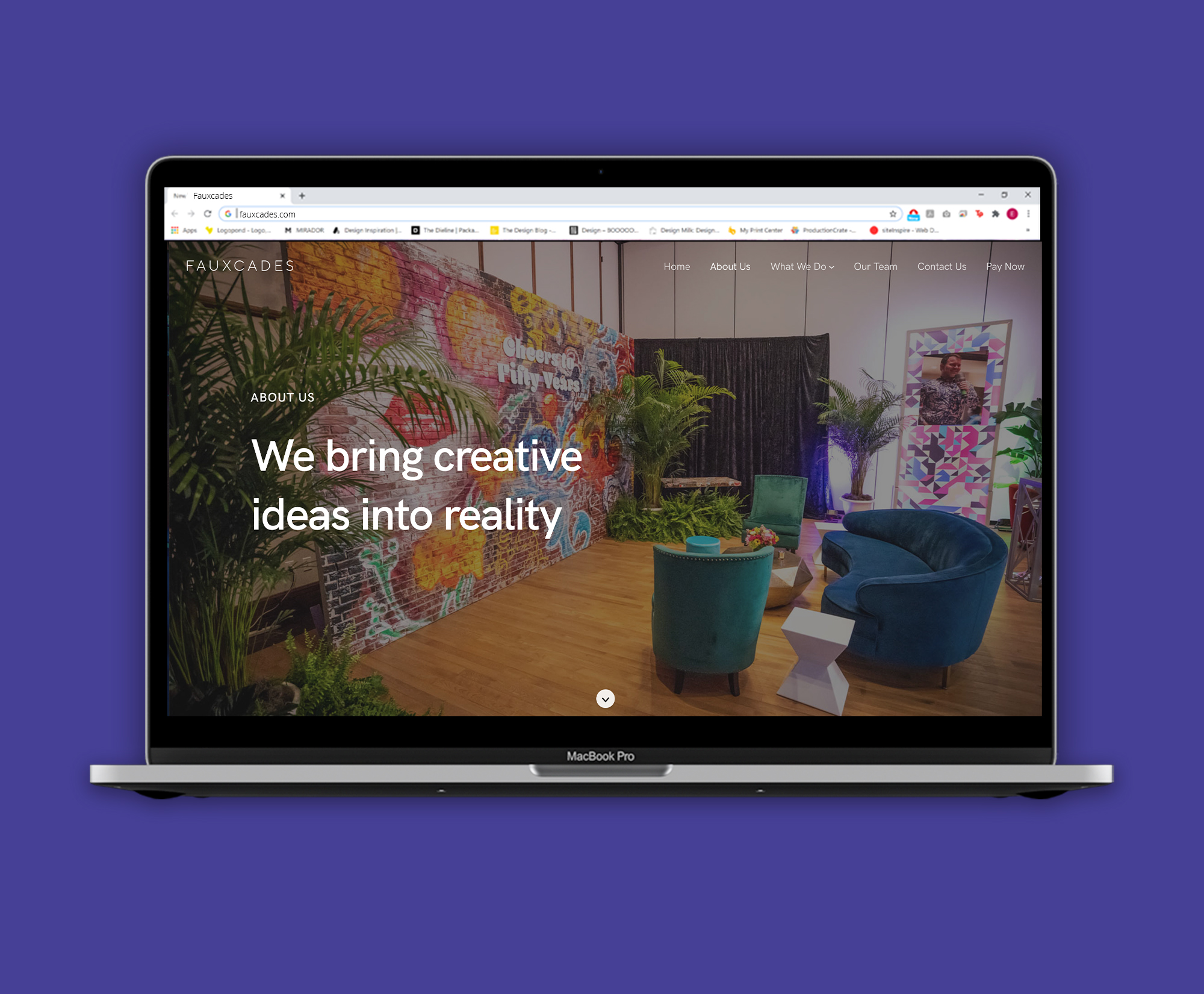
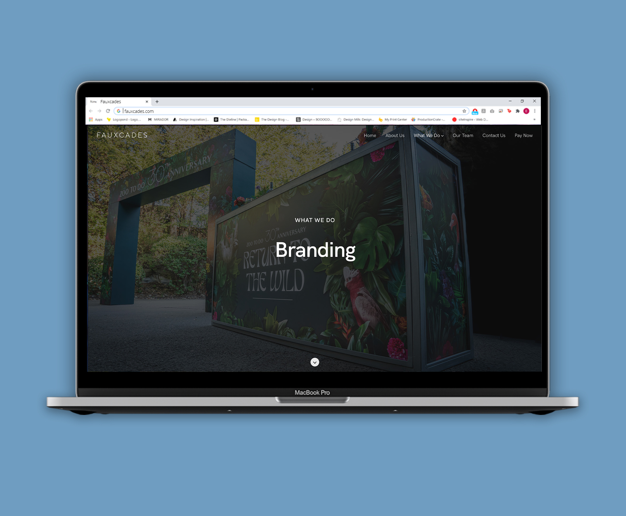
Fauxcades
Web Design/UX Design
To Create a New Web Experience.
- Project Objective
- Fauxcades Inc. was in need of a drastic modernization of the company's webpage. The old site did not fit the comany's needs which were to showcase Fauxcade's event services with potential clients. The objective was to modernize and present clients with a cleaner and more user friendly website experience.
- Project Role
-
Lead Designer
Lead Reseacher
Lead Developer
Project Team Members:
Nick Gonzales — Designer
Jefferson Muncy — Designer - Project Timeline
- This project spanned over 2-3 months starting early February 2022 to live launch in Late April 2022.
The Process
The Research
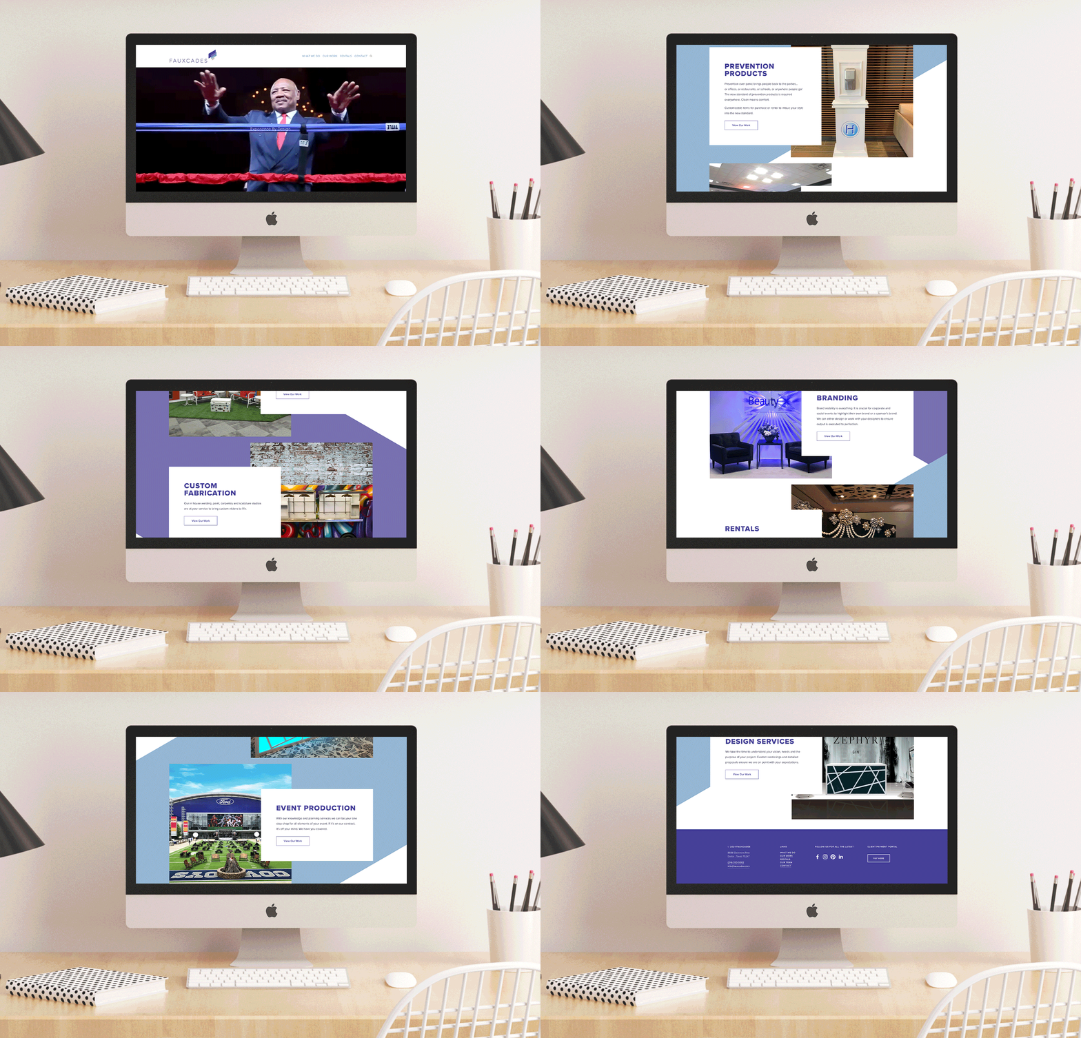 What Fauxcades's website used to look like
Introduction
The Need For Change
Event organizers like Fauxcades typically use their website to showcase their design skills and to entice potential clients to choose their company. However, the company had increasingly heard several comments from clients as well as employees pushing for a redesign of the corporate website. I was tasked to lead this change along with the help of my coworkers.
The Redesign Process
Initial Questions
The first step was to conduct in-person interviews with both the company owner and fellow event coordinators to learn their opinion on what could be improved with the website and what frustrations they had currently experienced. This interview process was also expanded to current clients with their comments below:
- Owner Comments
-
The owner, Kate Fishel, shared her vision on how she wanted to present Fauxcades as a company. She believed the site needed to be expanded with specific examples of what they do and to allow the customer a new view of Fauxcades and the processes from ideation to creation.
"The ultimate goal is to get people more interested with Fauxcades, right now there’s no organization, very few pictures, and overall it’s not a pleasant picture for customers. I want something more modern and focused on our product — the event." - Event Coordinator Comments
-
Event coordinators also shared similar frustrations surrounding the website. They found that clients often would have little to no examples of imagery of how certain items looked. While the competition had a portal where clients could explore rental items and compare, Fauxcades had no such system in place.
"The website is a mess. The image gallery is unorganized and simply doesn’t work. We need a place where clients can view our products; as it is right now very few people actually use the website to find what they want." - Customer Comments
-
While the experience was bad for event coordinators to show what Fauxcades could offer, for customers it was even worse. The most common complaint surveyed from clients was that there were no examples of work other than the home page and the gallery was no help because it was unorganized. Paying was also a hassle because the button to pay was obscured in the footer.
“Quite honestly we booked your vinyl service without knowing how the final product would come out. The website didn’t have any reference pictures and internally we were scared that the vinyl cling would look terrible, but in person it looks amazing. You really need to update your website.”
With our in-person interviews done, it was imperative that my design team fixed these issues. My team and I were committed to fulling the owner, Kate Fishel’s, wishes and offering a new clean and modern website with a focus on addressing the clients’ complaints that were discovered in the interview process. This leads us to the next building block, establishing the framework of the website.
Inital Planning
 The revised sitemap for Fauxcades
Brainstorming
Understanding the user flow
The main problems surrounding the current Fauxcades website was that there were no specific event examples and no organization. I understood that the client wanted to see what the company could do before they would commit to a full-scale contract. For that, we developed a user flow in which we understood how the user would browse the website, from using galleries, to browsing rental items, and finally, contacting the company for a meeting.
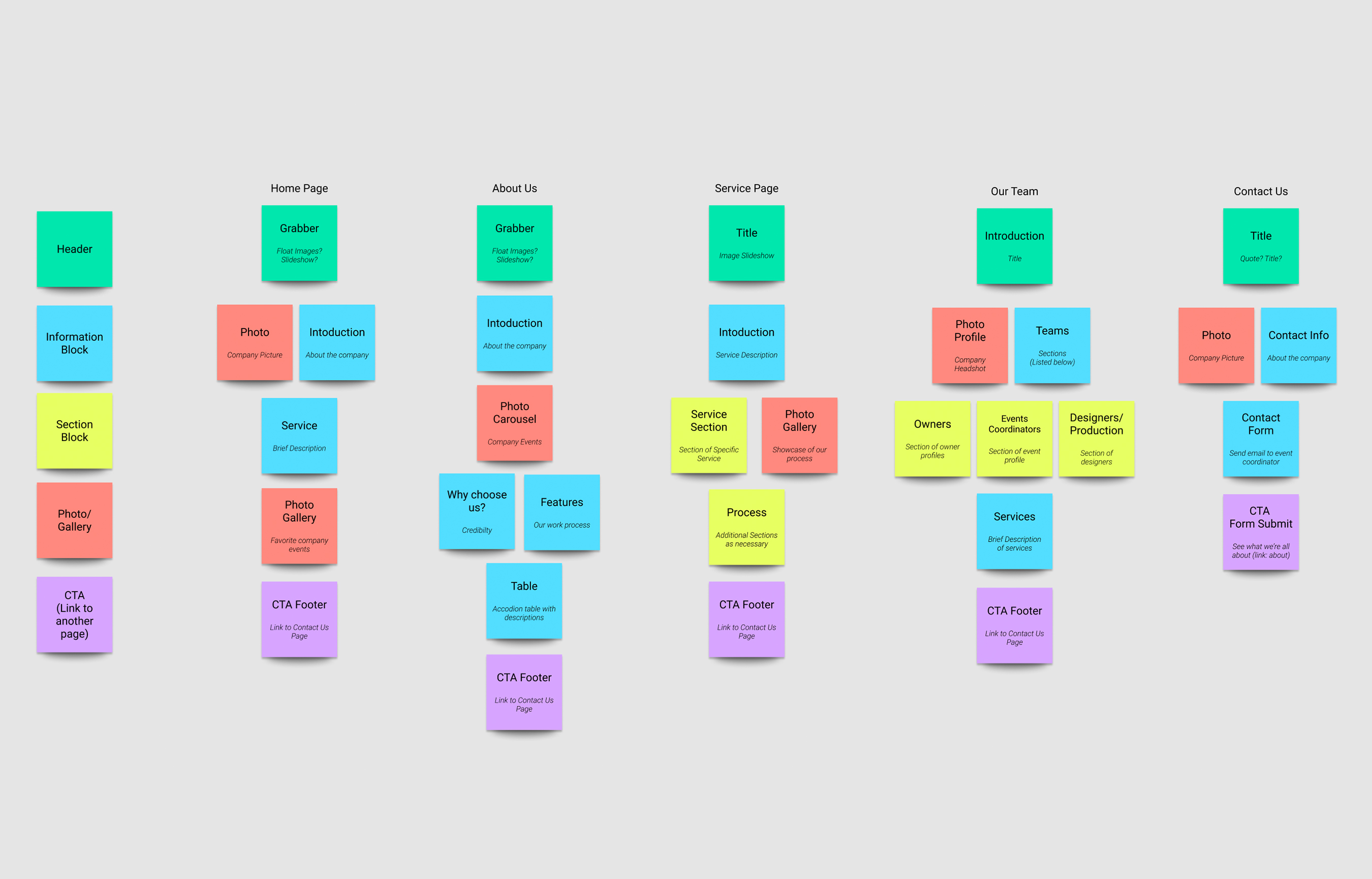 Our initial framework, color-coded by information type for the webpage
Setting the framework
Each service would have its own separate page, allowing the clients a more expanded view of Fauxcades services. My team and I brainstormed and established an outline of how we wanted each page to be organized and thought about how the client would see each specific example and service-related category. This framework would establish the base line for organization when transitioning to the wireframe stage.
By understanding the user flow, I developed a new optimized site map. The main categories that were on the top navigation were About Us, What We Do, Our Team, and Contact Us. Also included was a tab for payment, located directly in the navigation bar for easy access by clients who needed to pay their contracts. By utilizing this new site navigation, it helped solve some of the issues that we were previously having problems with:
- Organization of Services — Clients were able to immediately see the services we offered and since each page was separate, they were able to easily see a service they were interested in with new detail.
- Client Pay Portal — Instead of hidden in footer, the payment portal was now more prominent allowing clients to easily pay their invoices without having to search or scroll all the way to the bottom of the website.
Wireframing
Constructing the Layout
The Plan
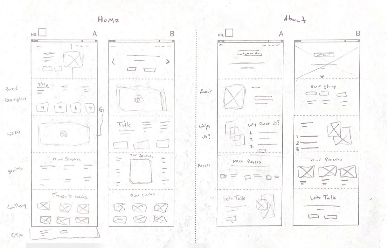
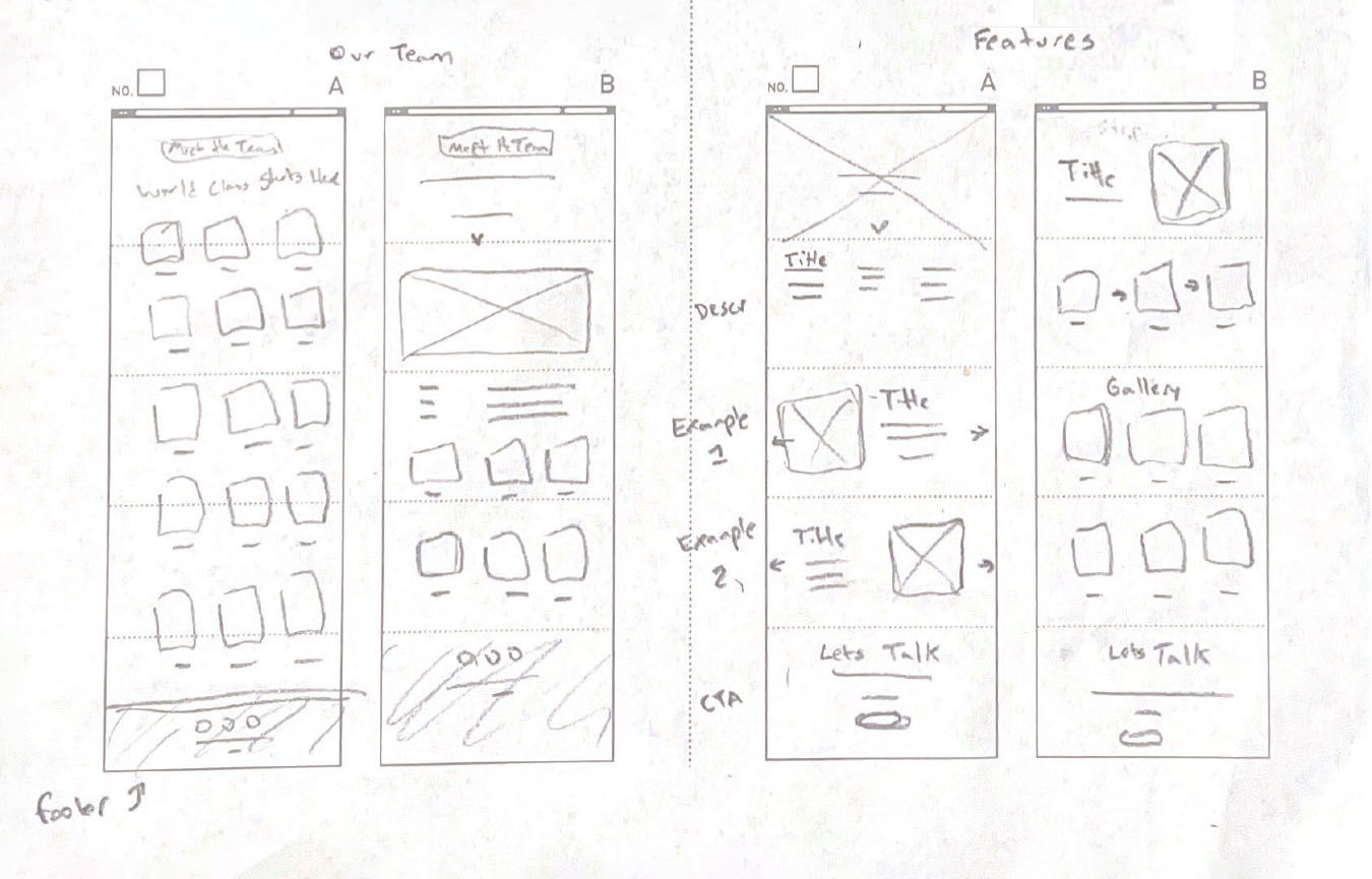
When creating the wireframes, I looked back at the research we had done with our user flow and frameworks. This stage involved bringing the team together to discuss organization practices and the best way to present the information to fit to our overall objective. Two seperate versions were created which led us to the first testing phase of the initial wireframes.
The Wireframing Stage
Internal Feedback
I sent out a quick wireframe template to our client-facing teammates to quickly inquire what should be added or changed from our current website pages. The purpose of this was to discover simple improvements that could be executed quickly. The feedback we had from our initial test helped narrow our design focus and establish a more refined webpage. Some of the feedback I received was:
- When showing images to our clients it was important to note what items Fauxcades worked on so that way the client knows how Fauxcades can elevate their event when everything is placed together.
- A big feature request was the addition of more videos and descriptions of our process to further humanize the company and showcase that everyone works together as a team.
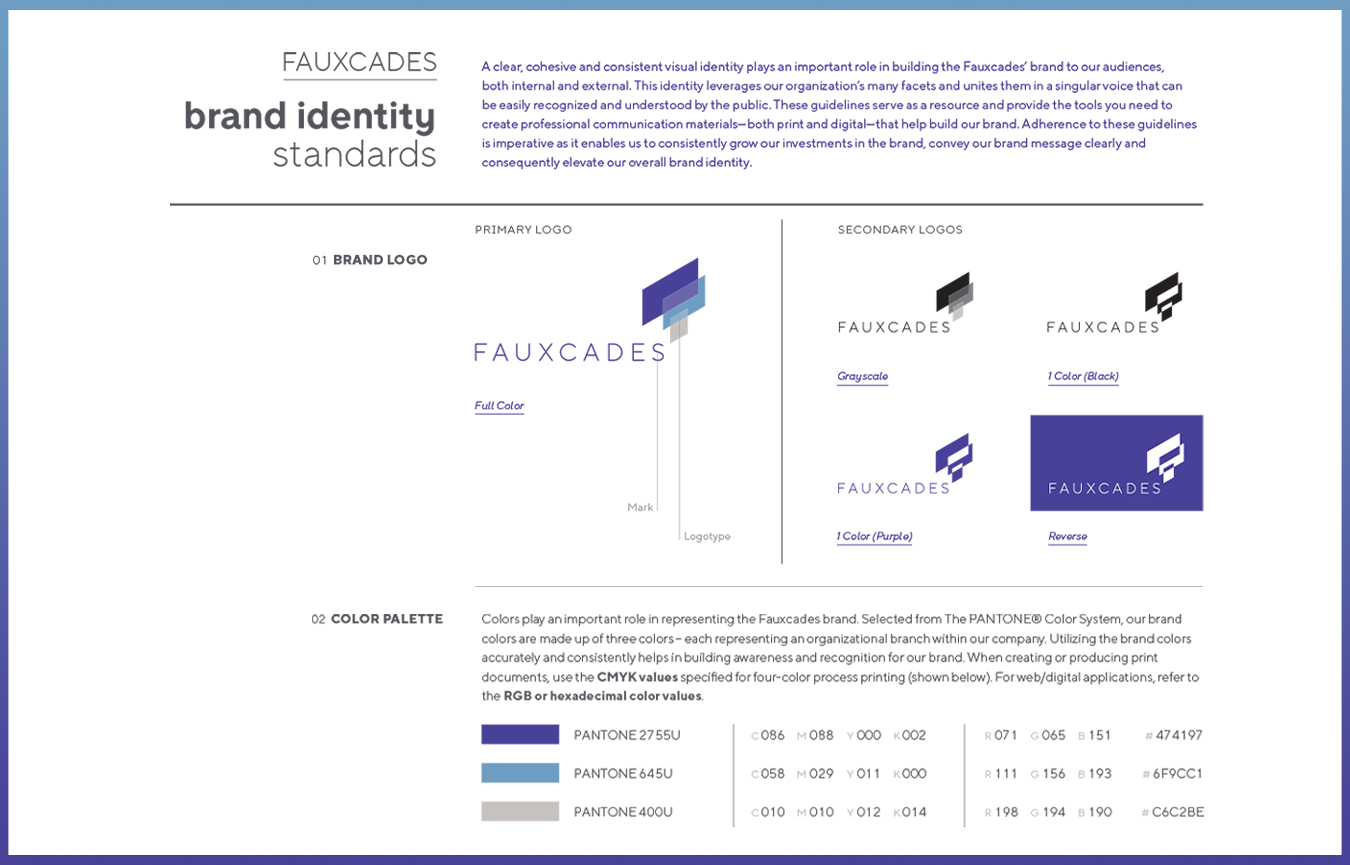 Fauxcade's brand guidelines
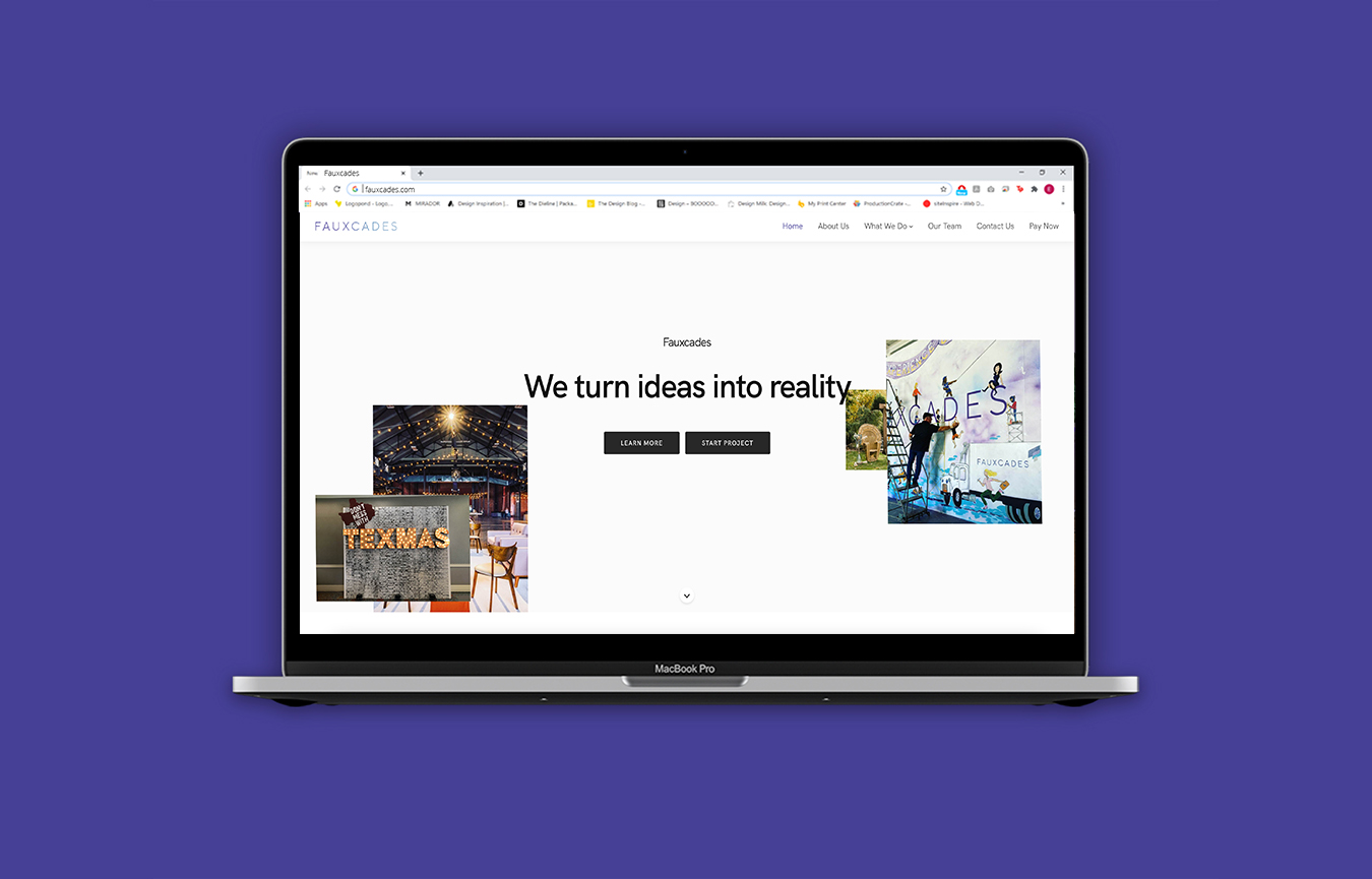
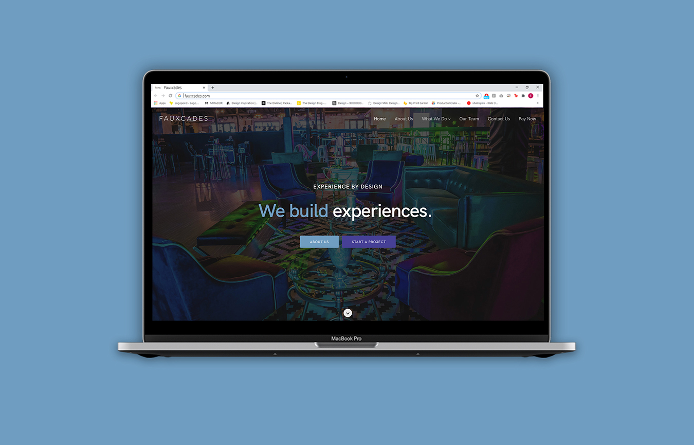
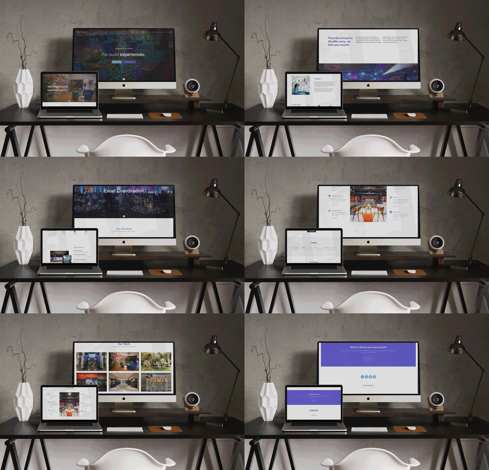 The final redesign of the Fauxcades website
